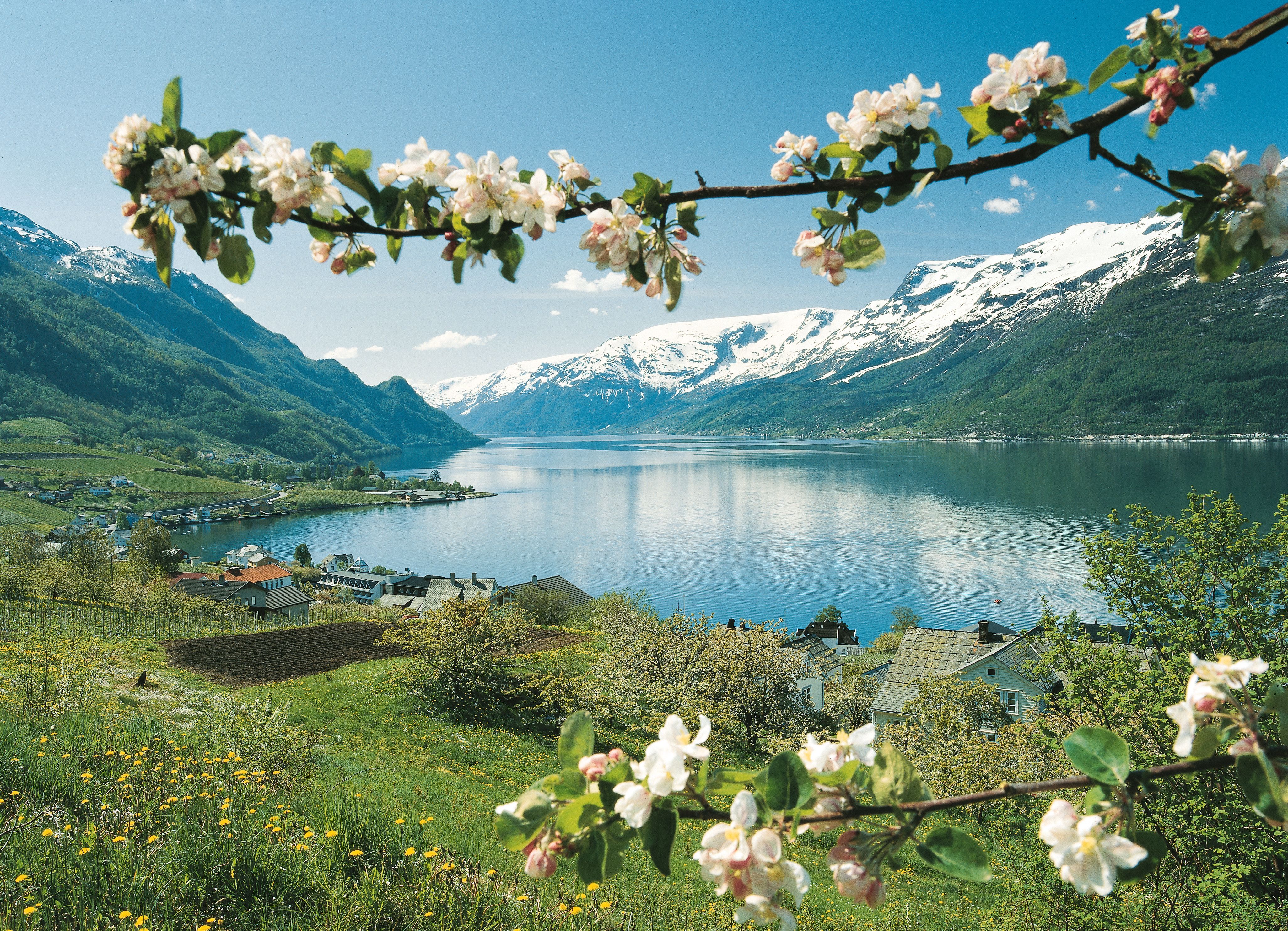
With journeys at the core of our business, we allow each journey to help color our identitiy through a generative solution.

Our primary palette
Norway is known for its strong variation in season, and the colors that come with them. Our primary color palette is inspired by the way colors impact our surroundings.
Considering how we want our journeys to have the strongest visual impact with their images and colors, the primary identity colors for Up Norway are black and white. Our logo should always be presented in one of the two.
Black
White
Colored by the Seasons
Scandinavia and Norway in particular changes tremendously throughout the season, and this reflects our offering. When presenting journeys, and tailoring journeys for specific seasons, we can use the seasonal palette as background colors for social media material, printed itineraries and communication with the client.
Spring
Summer
Fall
Winter
Natural Backdrops
As an extension of our seasonal palette, we've developed a range of slightly brighter colors that mainly function as background colors and should be used for sectioning specific content.
Wheat
Grass
Stone
Sea
Wheat Light
Grass Light
Stone Light
Sea Light
Colored by the Experience
The primary source of colors for our visual identity comes from the journeys themselves. We want our travellers to become fully immersed in the visual impact of the journey, and thus the main imagery we select for a journey defines the color scheme.
See a few examples below, or try out the generator if you need to create a palette for a journey.
Generate Journey Palette
Upload an image from a journey, and the generator will extract the provided color palette so you can preview what a journey would look like.


